Didot Typography Poster
The goal of this typography project was to study a selected typeface and then showcase it in an 11x17 in. poster.
I wanted my design to be like a billboard and attract the audience's attention and not bore them with terrible navigation solutions and massive amounts of content. I use very simple typography and color palettes in order to create depth and balance and constitute a dynamic visual hierarchy.
I utilized the techniques I learned regarding the Gestalt Principle to produce sets of thumbnails in to put my ideas on paper.
The Didot typeface is very old and has a lot of strong personality. For example, it is classified as a Didone or Modern typeface. The Didot letterforms have a horizontal stress, flat and unbracketed serifs, and a high contrast between thin and thick strokes. Through my design I wanted the typeface to speak for itself, therefore I decided to go in a direction with minimal or no iconic imagery.
Follow my Pinterest boards Didot and Typography to observe my visual research.
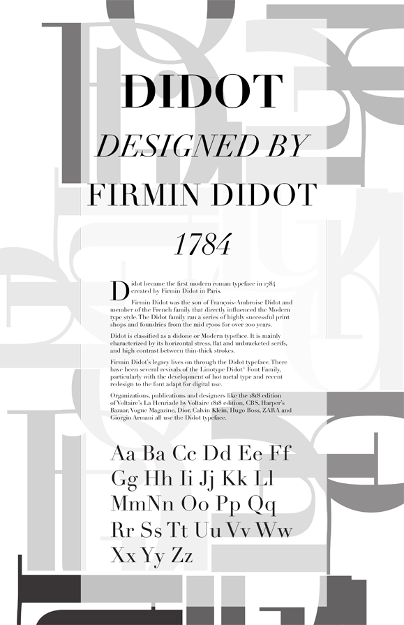
Final Design
go top